Around a year ago, I took a class where I had eight months to research any topic of my choice and report my findings in an end-of-year final presentation and paper. I knew I wanted to research my favorite board game, Diplomacy, but had no idea of how to go about doing so. In classic procrastination fashion, I had the months go by, and desperately needed to get started on something. That’s when Mario Huys saved the day by happily supplying me with the data from Vlad Niculae's (et al.) 2015 study named Linguistics Harbingers of Betrayal on the condition that I write up my findings. Thank you for saving my research project Mario, and I hope you enjoy this article.
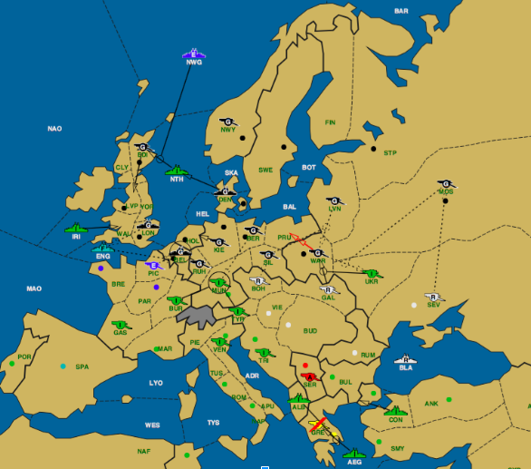
My investigation focused on the effect vulnerability had on the probability of being attacked/stabbed. To put it plainly, I wanted to know if a player would be attacked more frequently if an opposing player had a greater opportunity to take supply centers. Due to a pool of around 91 games (I had access to more, but cut a lot of them out due to an inability to analyze variant games), I had to make some large assumptions. Firstly, I quantified vulnerability by the number of supply centers bordering, or being currently occupied by, an enemy unit. In the case of the game above, Italy had thirteen units. The German territories Warsaw, Moscow, Berlin, Kiel, Holland, Belgium, London, Liverpool, Edinburgh, Norway, and Denmark were bordered by an Italian unit. Therefore, Germany was vulnerable to Italy by eleven supply centers. This method doesn’t account for the position of the German units: in other words, how well defended Germany is from an Italian attack. It also can be misleading: in this case, it is impossible for Italy to take 11 supply centers off of Germany. Despite these issues, it greatly simplified the problem of determining vulnerability.
I defined an attack as any change of supply centers from one country to another. This can be troublesome as many alliances have partners swap supply centers with each-other. Thus, it may be an organized maneuver rather than an attack. In addition, oftentimes an attack will fail (or the attack might occur during the spring phase) and result in no supply centers being taken. This would not be considered an attack by my program. These reservations should be considered carefully alongside the results.
In order to collect data, I considered all 91 games from the perspective of each country. For example, from Austria’s perspective, Austria might border 2 Russian supply centers. Thus, the vulnerability is 2. Then, Austria might have taken one of Russia’s supply centers. Thus, the attack value would be 1. Therefore, each data point was a relation between two countries during a fall movement phase with a vulnerability greater than 0. I discarded any results with 0 vulnerability because there is a 100% chance that there will be no attack, and so it provides no useful information. I also separated the data based on vulnerability, so that a relationship between vulnerability and attack rate could be drawn. Note that Austria’s perspective on Russia will be different from Russia’s perspective on Austria. Russia may have had a different vulnerability value on Austria, and attacked for a different amount. Thus, each data point should be unique.
The following is a sample output from my program from Austria’s perspective. It shows how vulnerable each country was to Austria, and the amount of changed supply centers:
1903.0 ('with risk', 0, 'stabbed England for', 0) ('with risk', 0, 'stabbed France for', 0) ('with risk', 0, 'stabbed Germany for', 0) ('with risk', 0, 'stabbed Italy for', 0) ('with risk', 2, 'stabbed Russia for', 1) ('with risk', 1, 'stabbed Turkey for', 0)
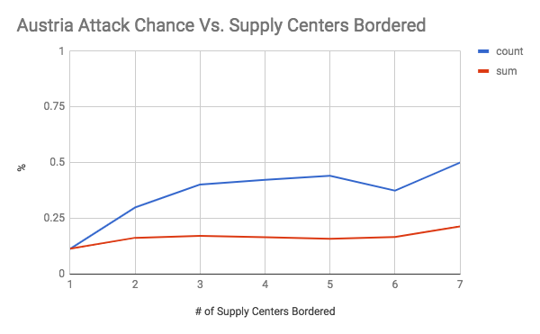
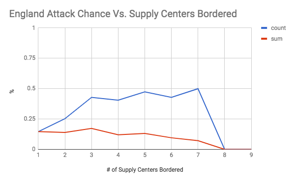
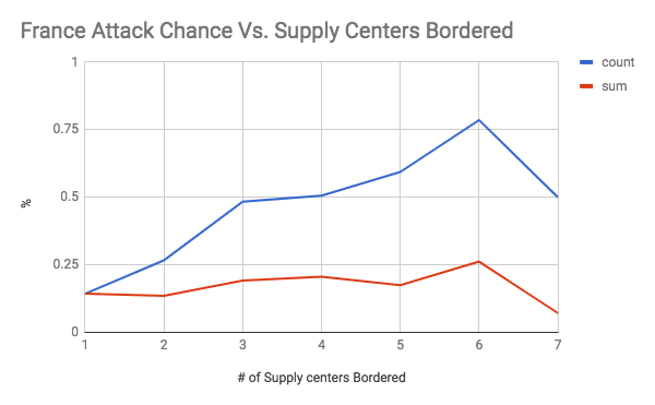
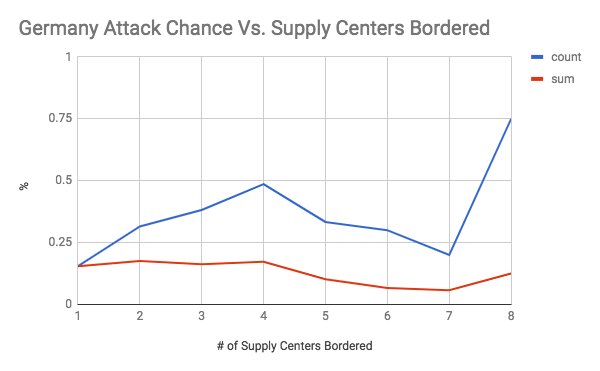
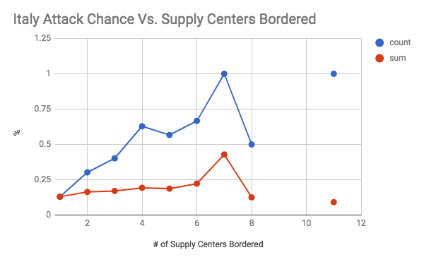
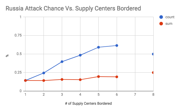
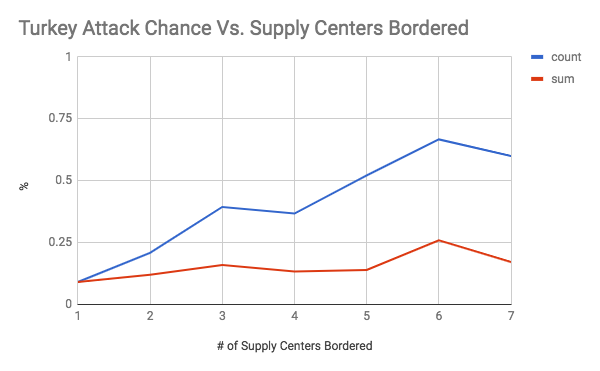
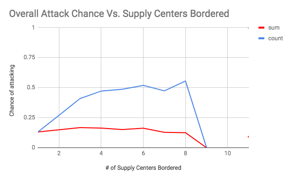
These graphs show the chance of an attack occurring on the y axis, and the number of supply centers bordered (the vulnerability) on the x axis. The first seven graphs are separated by country. The final graph is an overall graph that includes all of the data points. The blue line, or “count”, is the raw chance of an attack regardless of how successful it was. As long as one dot changed hands, it was counted. The number of attacks was then divided by the total number of times there was a certain level vulnerability to get a rate of attack. The red line, or “count”, is a weighted chance. Thus, if a change of 2 supply centers were to occur, it would be counted twice. However, it had a larger denominator as well as the number of supply centers was accounted for. For example, for a specific data point if there was a vulnerability of 5, and only 2 dots were taken, then the sum would add 2 to the numerator and 5 to the denominator, while the count would add 1 to the numerator and 1 to the denominator. An important note must be made here, which is that there was very little data when the vulnerability was 6 or greater (usually less than 10 data points). Therefore, the results for 1-5 supply centers bordered are the most meaningful.
As shown by the overall graph, the chance of an attack seems to increase between a vulnerability of 0 through 4. Thus, the results support the conventional wisdom of avoiding being overly exposed to any one country, even if they are close allies. It is also interesting to note that the sum lines seem to be relatively stable. This could indicate that while the chance of an attack increases, it is balanced out by less efficient attacks that take a lower percentage of vulnerable supply centers (at 100% efficiency, you would expect the count and sum lines to coincide, like they do at a vulnerability of 1). Another interesting finding was how the chance of attack seems to level off between vulnerability 4 through 8 at roughly a 50% attack rate. This is an interesting result because it indicates that positions with an exceptionally large amount of vulnerability may be less risky than they seem. It was also interesting to note how certain countries were more treacherous than others. For your convenience, please refer to the below graph:
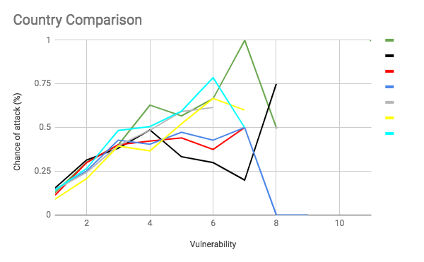
This graph is the count line of each country on the same plane. I tried to use the standard FtF colors for each country, but made a few adjustments for legibility (for example, Russia is grey rather than white). Green is Italy, black is Germany, red is Austria, dark blue is England, grey is Russia, yellow is Turkey, and light blue is France. It shows that Italy, France, and Russia seem to be overall more treacherous than average. Germany, England, and Austria seem to be attacking more often than average at a lower vulnerability but that is less true at higher vulnerabilities. Finally, Turkey seems to have an unusually low attack rate between a vulnerability of 0 through 4. This could reflect the different realities of each country. A low attack rate at low vulnerability could indicate Turkey’s slower early game. Austria and Germany’s low attack rate at high vulnerability could be an indication that the risk of attacking a friendly country is greater for them as corridor countries that are easy to rally against. Russia, France, and Italy having high attack rates could indicate that players tend to play them more aggressively.
As Diplomacy players become more vulnerable to each other, the chances of conflict generally increase, yet level off at a certain point. While this sounds intuitive, especially given the nature of the game, it is interesting to see that a considerable portion of relationships continue despite a lot of vulnerability. It is also interesting to think about the circumstances that result in different countries having different reactions to vulnerability. Beyond the game, perhaps this sheds some light onto other social interactions as well.

|
Jorge Zhang (jzhang16@cps.edu) |
If you wish to e-mail feedback on this article to the author, and clicking
on the envelope above does not work for you, feel free to use the
Dear DP...
mail interface.